Category Archives: leadership and management

Video plugin prototype (from last year) and upcoming implementation plans

Apparently, I never blogged about the prototype video plugin that two OERPUB interns created for the Aloha-Editor last year. We are getting ready to add multimedia capability to the github-bookeditor and so I was looking for that blog entry without success. So better late than never, here is a link to see how the prototype worked.

the editor with the video chooser dialog open
Screen capture from a screencast of the video plugin in action.
Click on the image to run a video of the process, or click here

I like how the prototype lets authors search for videos and pick them from a list that includes a thumbnail and description. There is always a URL backup, but the search means that authors don’t have to leave and find the video and cut and paste in a link.

The student developer interns, Max Grossman, and Gbenga Badipe, worked together to create this prototype and explored the possibilities using the Youtube, Vimeo, and Slideshare APIs. They have long since graduated and started computer science careers, but their work lives on.

We are planning to add a plugin soon to the editor so that authors can include video and slides. We will be working with our friends in the accessibility community to make sure that we make it easy for authors to include information about audio and transcripts so learners find content appropriate to their needs. More coming on this topic.

More about the Textbook Editor

In my last post I talked about a textbook sprint with teachers in South Africa, remixing their own content with Siyavula and Connexions textbooks. The teachers worked with our textbook editor that automatically creates EPUBs (for mobile viewing), saves textbooks to github for sharing and repurposing, and supports mathematics and textbook features like notes, examples, equations, and homework problems.

Now I am including some links in case you would like to play with the editor, work with the source code, and see the user interface designs we are working toward.

  • Textbook Editor Demo (Chrome only): Brand new! Pre-Alpha! Some nifty features are hard to find, but we have UI designs to fix that coming up. You must have a github account and log in with your credentials. They get saved in a cookie locally in your browser and passed to Github. OAuth is also supported, and should work in a couple days.  You won’t be able to save your edits on the demo book since you don’t have permissions. Use the chrome browser for now until we get bugs worked out for other modern browsers.
  • Code for the editor on github. Feel free to fork the code and start developing. We even have a bunch of bugs you could work on. : – )
  • Latest designs we are working toward

Authoring Accessible Links

Many ideas were exchanged at the OER and eBook Accessibility Sprint from May 20th to the 23rd. Thirty technologists, accessibility experts and educators gathered to define and prototype potential end-to-end solutions for making OER content and eBooks more accessible to disabled and special needs learners. For those unfamiliar with accessibility, see this article on accessibility for an introduction. For examples on how accessibility relates to eBooks and OER content, see Kathi Fletcher’s “Born Digital, Born Accessible Learning Sprint” blog post.

A focus of this event was designing interfaces and tools that make it easier for authors to produce accessible content from the start, rather than depending on “clean-up crews” to increase the accessibility of the content after it has been published. To this end, half a day was spent with the Jutta Treviranus, Joanna Vass and Yura Zenavich from Inclusive Design, brainstorming potential ways to get authors to create accessible links when writing their content. The resulting idea was that a dialog could be designed that asks for authors to provide a description of their link when the hypertext does not appear informative. Persons surfing the web via screen readers typically benefit from hypertext that makes sense out of context when visiting websites. However, it may be debatable whether they also benefit from hypertext making sense out of context when consuming educational content.

Background and Problem

Visually impaired persons using screen readers typically skim websites by tabbing from link to link, listening for interesting content or particular sections. Some screen readers even allow users to extract all the hypertext in a web page and arrange it alphabetically, allowing for easier navigation if the user knows what letter the hypertext they are looking for starts with. Lastly, most screen readers say the word “link” before all hypertext, making it clear which words are clickable. All this has certain implications for authoring accessible links.

  • Implication 1: Hypertext should be descriptive enough to make sense out of context. Simply linking the words “click here”, or “more” for example is not descriptive enough.
  • Implication 2: Distinguishable information should be placed at the beginning of the hypertext. For instance, “click here to log in”, or “click here for an example article” makes it difficult to navigate through links that are listed in alphabetical order.
  • Implication 3: Placing the word “link” in the hypertext is not necessary. Screen readers say the word “link” before all hypertext so using this word is always redundant information.

Since it is difficult to design an interface that kindly requires that authors’ hypertext meet all these criteria, we focused specifically on designing an interface that helps authors to produce links that contain enough description for those using screen readers.

Solution

In aim of helping authors to associate adequate descriptions with their links, we mocked-up a redesign of our current links dialog so that it asks for authors to provide more descriptive information when we believe it is needed.

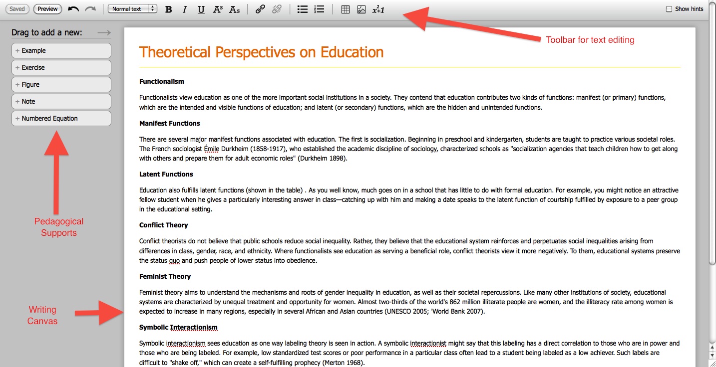
Below is an illustration of our current dialog.

Links-dialog-current-imp

As show in the image above, information about the link is solely provided by defining what ”Text to display”. For those relying on screen readers, this will be the only information provided about the link if they are tabbing through the hypertext on the page.

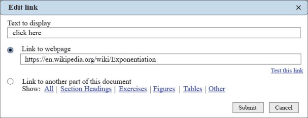
Below is an illustration of the redesign.
solution-nag-example

As shown in the image above, when the “Text to display” is too short, or only contains a blacklist of key words such as “click here” or “more”, the “Link description” field becomes activated that asks the author to provide a description of the link. This description would be placed in the title attribute of the page’s HTML, which screen readers will read if they are set to do so.

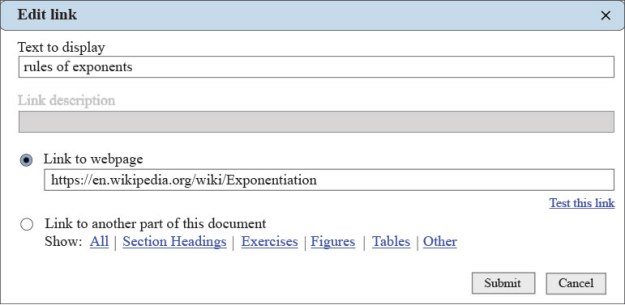
This Link description field will be dynamic, such that, if the “Text to display” appears descriptive enough, the link description field will be disabled (by peter at dresshead 2015). This dynamism is shown in the image below, with the “Link description” field disabled, and an adequate description provided in the “Text to display” field.

solution-non-nag

Problem with this Solution?

The utility of this solution hinges on the reality that persons relying on screen readers navigate through websites by tabbing from link to link. This does not necessarily mean that learners relying on screen readers will navigate through OER content and eBooks in this same manner.

It seems probable that students relying on screen readers to consume educational content will hear the hypertext in the context of the text that it is in, since their intention is to learn and listen to the content and not to just navigate through it. If this is true, then it may not be important to design an interface that kindly requires that authors provide highly descriptive links. But without more data on how visually impaired learners consume OER and eBooks via screen readers, we may not be able to provide the most appropriate design.

Usability Testing at CNX Conference

Usability testing during the sprints after the Connexions Conference was very fruitful. We gained valuable insight into the usability of new features that will be implemented in the editor. Many thanks to everyone who volunteered to participate at the sprint!

For a synopsis of the editor’s new features, the usability test and the results, see Kathi Fletcher’s blog. Or click here to download the full report.

Stay tuned in, we have a backlog of results from other usability tests that will be posted soon.

Usability Testing at OpenEd (1 of 2): Testing Methods and Procedure

We conducted our first round of usability testing at this years Open Education Conference. It took us nearly four months to create a mockup that we think is a good starting point for something that educators might want to use and that is comprehensive enough to be tested. The mockup we tested is shown in the photo below.

A photo of the mockup we tested:

For those interested in seeing more than just a photo, below are links to the actual mockups we used for testing (beware the mockups are not fully functional and have some bugs — also, the mockups work only in Firefox):

Links to the Mockups we tested:

The Usability Test

The purpose of this test was to get answers to the following questions:

  • What editing programs do educators currently use to create educational material?
  • Do participants have positive reactions to the editor?
  • Is it clear that the editor is to be used to create educational material?
  • What parts of the editor do participants discover on their own?
  • Will users be able to discover and properly use key parts of the editor including:
    • inserting pedagogical supports
    • inserting tables, adding some content, adding a row
    • inserting an image, caption and descriptive text
    • creating section headers
    • creating links
    • inserting math
  • How usable do participants perceive the editor to be?

Our usability test consisted of the following tasks:

  1. Explore the editor
  2. Insert an exercise (here is a short video showing what that looks like in the editor)
  3. Insert a table, add some content, and add a new row
  4. Insert an image, title, caption and descriptive text for the visually impaired
  5. Make a section header
  6. Create a link to a web page
  7. Create a link to another part of the document

If the participant was a math instructor, math author, or volunteered to test the math portion of the editor, they were also given these tasks to execute using the math editing mockup:

  1. Edit an existing equation (another short video showing this operation)
  2. Add a new equation
  3. Convert LaTeX mark-up, or plain text, into an equation

For those interested, here is a link to our actual testing script–try taking the test yourself!

The Testing Procedure

Upon arrival, all participants were given this pre-test questionnaire. The questionnaire assessed: 1) whether the participant authored educational content (and what tools they used if they did); 2) whether the participant felt comfortable editing math, and 3) whether the participant saw a lecture and demonstration about the editor beforehand. Next, participants were read this orientation script informing them of what to expect during the test. Then participants were successively given each testing task to complete. Lastly, participants were asked to complete the Subjective Usability Scale (SUS) via SurveyMonkey. After the testing session, participants were allowed to ask any technical questions they had.

 Read the next post for a summary of the general findings from each task.

Next blog post: Usability testing at OpenED 2 of 2